Flood Mapping Visualization
In addition to my previous post about Flood Mapping and Damage Assessment, I decided to make two types of satellite imagery visualization:
- Times series animation with SAR images;
- Split-panel map with RGB Bands (“True color”).
Part 1.
Time series animations of Earth observation imagery are captivating and engaging (just look at the following image of the resulting animation).
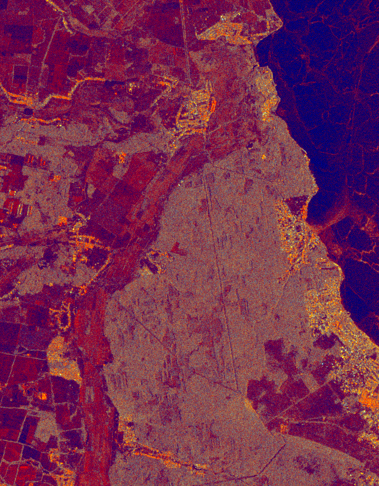
People tend to perceive visual information in “RGB mode 🌈”, and we can also visualize a SAR image as a multi-band RGB image. There is a common trick to using the VV band in the red channel, the VH band in the green channel, and the VV/VH in the blue channel.
On my GitHub repo, you can find the Google Earth Engine script, which produces time series animations using Sentinel-1 SAR GRD data.
Or, if you have a GEE account, follow the link.
Part 2.
A split-panel map is one of the easiest ways for the human eye to detect changes on the earth’s surface. But before looking at two Sentinel-2 MSI images in split-panel view, we face a problem… Clouds ☁️.
When you start working with optical images in Earth observation, you begin to think about clouds from a new perspective 🤔.
To handle this problem, I implemented Sentinel-2 Cloud Masking with the s2cloudless technic. Clouds are identified from the S2 cloud probability dataset (s2cloudless), and shadows are defined by cloud projection intersection with low-reflectance near-infrared (NIR) pixels.
All stuff I have done in geemap - a Python package for interactive mapping with Google Earth Engine, ipyleaflet, and ipywidgets.
See source code (jupyter notebook) and final visualization ⬇️.