The main goal of this project was to implement my Google Earth Engine skills and dive deeper into SAR remote sensing analysis techniques. Using SAR data on flood mapping is a standard and reliable method for determining the extent of significant floods. The main advantage of using microwave data is that it can penetrate cloud cover, operate in any weather conditions, and provide timely and crucial information both day and night since it is not dependent on sunlight for reflectance.
Flood Mapping and Damage Assessment
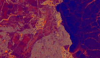
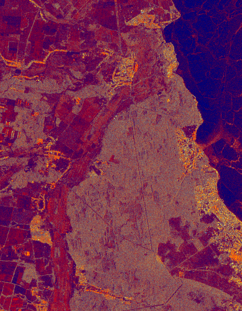
Consequences of intentionally flooding the countryside in the Irpin River basin northwest of Kyiv.
Skills & Competencies
Key skills, tools which I used in current project
Google Earth Engine
SAR RGB visualization
SAR change detection
Sentinel-1/2 data
geemap - Python package
Table of contents
Part 1. Spatial Data Analysis
In the first days of the war, Ukrainian forces flooded the area in the Irpin River basin northwest of Kyiv. There is an excellent article in The New York Times about why it happened and how efficient it was in terms of military strategy.
According to the materials I mentioned above ⬆️, the workflow looks like this:
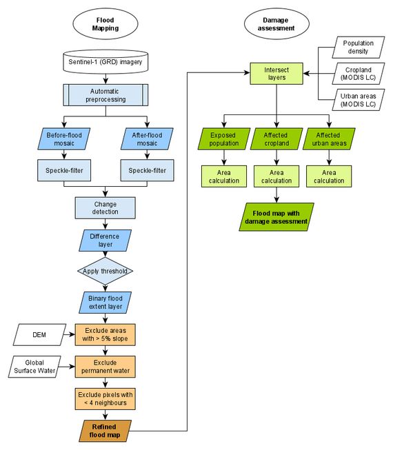
The GEE script with comments you can find on my GitHub repo. Or, if you have a GEE account, follow the link.
I would like to emphasize the study’s purpose of this project. With the existing limitations of using current Flood Mapping and Damage Assessment techniques, I want to point out the difficulties of detecting floods in urban or densely vegetated areas. But it could be solved using high-resolution SAR data from new space 🛰️ companies like ICEYE or Capella Space.
Open GEE App and find result ‘numbers’ and examine existing data layers used for analysis.
Part 2. Visualization
Visualization is a crucial part of geospatial work. For current project I utilized two types of satellite imagery visualization:
- Times series animation with SAR images;
- Split-panel map with RGB Bands (“True color”).
Time series animations of Earth observation imagery are captivating and engaging (just look at the following image of the resulting animation).
People tend to perceive visual information in “RGB mode 🌈”, and we can also visualize a SAR image as a multi-band RGB image. There is a common trick to using the VV band in the red channel, the VH band in the green channel, and the VV/VH in the blue channel.
On my GitHub repo, you can find the Google Earth Engine script, which produces time series animations using Sentinel-1 SAR GRD data.
Or, if you have a GEE account, follow the link.
A split-panel map is one of the easiest ways for the human eye to detect changes on the earth’s surface. But before looking at two Sentinel-2 MSI images in split-panel view, we face a problem… Clouds ☁️.
When you start working with optical images in Earth observation, you begin to think about clouds from a new perspective 🤔.
To handle this problem, I implemented Sentinel-2 Cloud Masking with the s2cloudless technic. Clouds are identified from the S2 cloud probability dataset (s2cloudless), and shadows are defined by cloud projection intersection with low-reflectance near-infrared (NIR) pixels.
All stuff I have done in geemap - a Python package for interactive mapping with Google Earth Engine, ipyleaflet, and ipywidgets.
See source code (jupyter notebook) and final visualization ⬇️.