The main idea of this project was to present the results of my previous work - Spatial Data Analysis of Civilian Harm in Ukraine, which was made in the Jupyter notebook, to a broad audience.
Geospatial Data Analysis of Civilian Harm in Ukraine
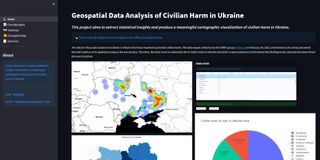
Web application for interactive dashboards and geospatial visualization of Civilian Harm in Ukraine.
Skills & Competencies
Key skills, tools which I used in current project
Data munging (pandas/geopandas)
Statistical Data Visualization (plotly)
Interactive maps (folium)
Streamlit
The web application looks suitable for this case for a few reasons:
- the data used in this analysis is continuous, and instead of launching the Jupyter environment every time, you open an app and retrieve updated results;
- the web app provides an additional interactive tool for data analysis;
- easy to share the results of work with “no-data science” people,
and in general, the web-based application works on a variety of devices on the web browser.
This web app combines different tools for data analysis:
- Charts & Graphs.
- Heatmap.
- Choropleth Map.
- Data Grid.
Please visit the web app for Geospatial Data Analysis of Civilian Harm in Ukraine to see the work results or find the Github repo for the source code.